
Where it applies
Go to Site builder → Theme. The colours you set here become the default for your entire public site — every block on every page, and every field on every form, reads from this same palette. You only need to set it once.
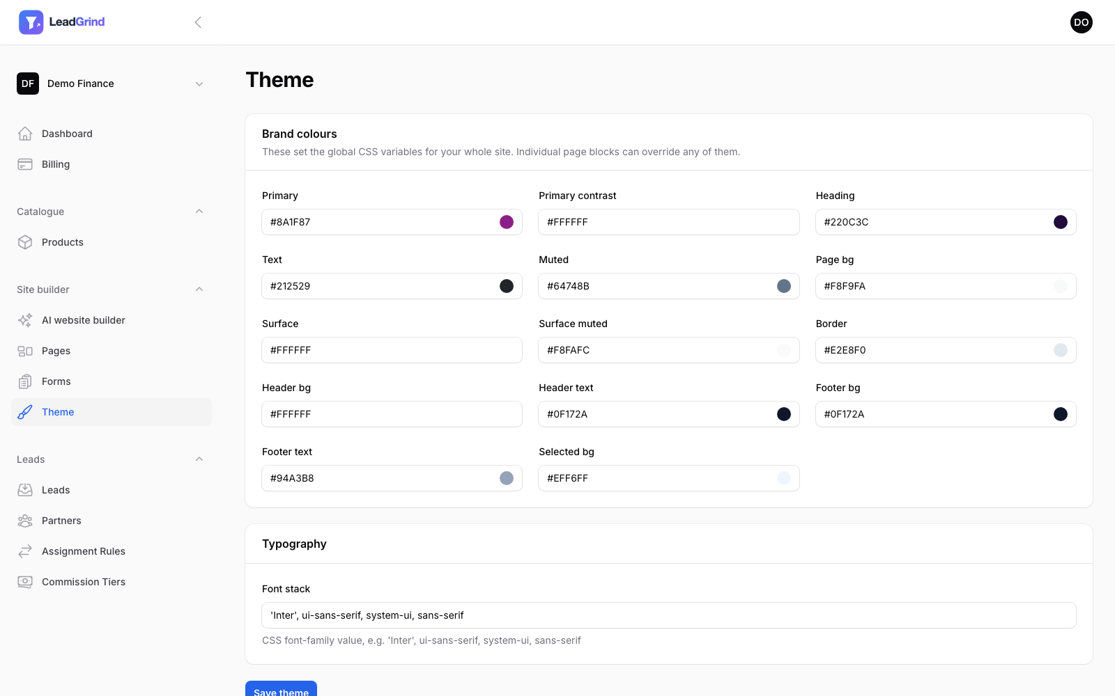
What each colour controls
The colours are grouped by what they're used for, not just "colour 1, colour 2":
- Primary / Primary contrast — your main accent colour (buttons, links, highlights) and the text colour that sits on top of it (usually white).
- Heading / Text / Muted — your main heading colour, body text colour, and a lighter colour for secondary/helper text.
- Page bg / Surface / Surface muted / Border — page background, card backgrounds, and border colours.
- Header bg / Header text / Footer bg / Footer text — your site's header and footer bars.
- Selected bg — the highlight colour used behind things like the active FAQ item or badge.
Each field is a colour picker — click the swatch to pick visually, or type a hex code directly.
Font
The Font stack field takes a CSS font-family value, e.g. 'Inter', ui-sans-serif, system-ui, sans-serif. If you're not sure, the default is a safe, professional choice — you don't need to change
it.
Overriding per-page or per-block
These theme settings are your global defaults. If a specific page needs different colours (a seasonal promotion, a different product line), you don't need to touch this page — individual pages and blocks in the page builder can override any of these colours just for themselves, without affecting the rest of your site.
Using the AI website builder's colour choice
If you used the AI website builder and gave it a logo or existing website, it already set your Primary colour to match. You'll land here automatically if you want to fine-tune it further, or set the rest of the palette to match by hand.